Mathers Museum
Web Redesign

This project came out of a combination of the needs and requirements for the university and the museum. The Mathers Museum is in a period of rebranding for itself and to come into compliance with the new university guidelines. An expansion of and new look for the website has been needed for some time and the WCMS offering allowed the Mathers to take advantage of the new system to create a new website.

01 Background

Team | Kiva Reinbold | Gengsu Tu
Time | September - December 2013
Timeframe | 12 weeks

IU recently created branding standards that all university units need to adhere to, and include color palettes, fonts, and other design elements. Additionally, the university has made a Web Content Management System available for departments to use to set up websites that do not require professional knowledge of web design, offer the ability for multiple author editing and participation, and further adhere to the branding standards.

02 Methology

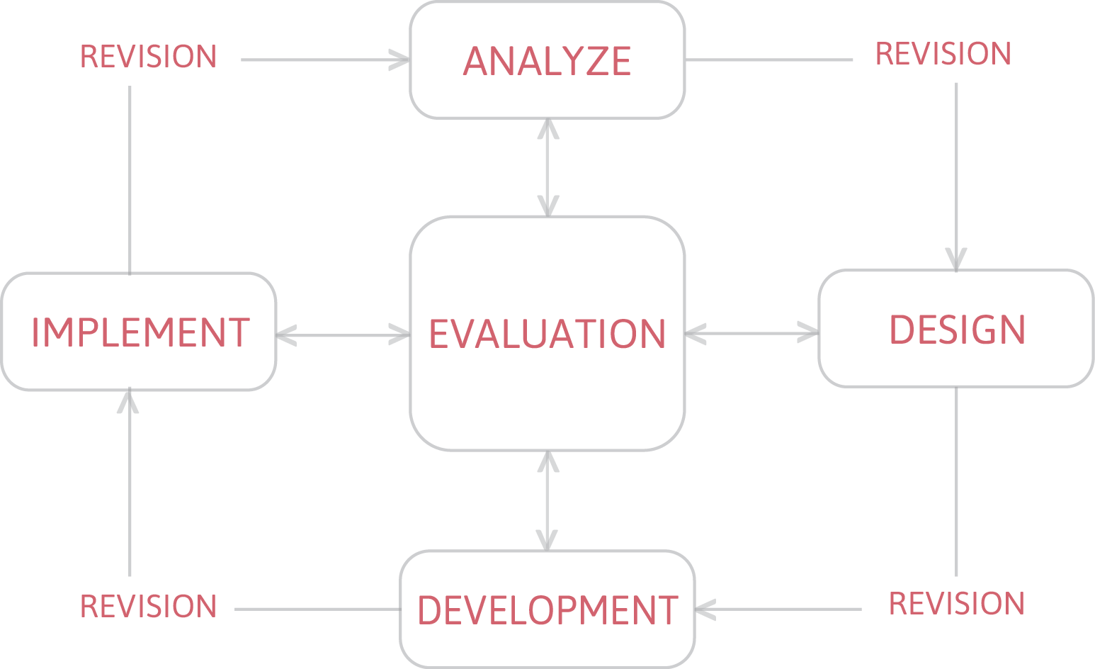
Next we discussed the method and steps for this project. Our plan was to use ADDIE, with the cycle of interrelated steps – analyze, design, develop, implement, and evaluate – as the basis for our process. We discussed the need to assess the current website through a variety of methods, develop content based on the results of that analysis and assessment, organize the content, design the site with an eye for usability, then evaluate and revise that design over the course of the project.

03 Current Site
Analysis

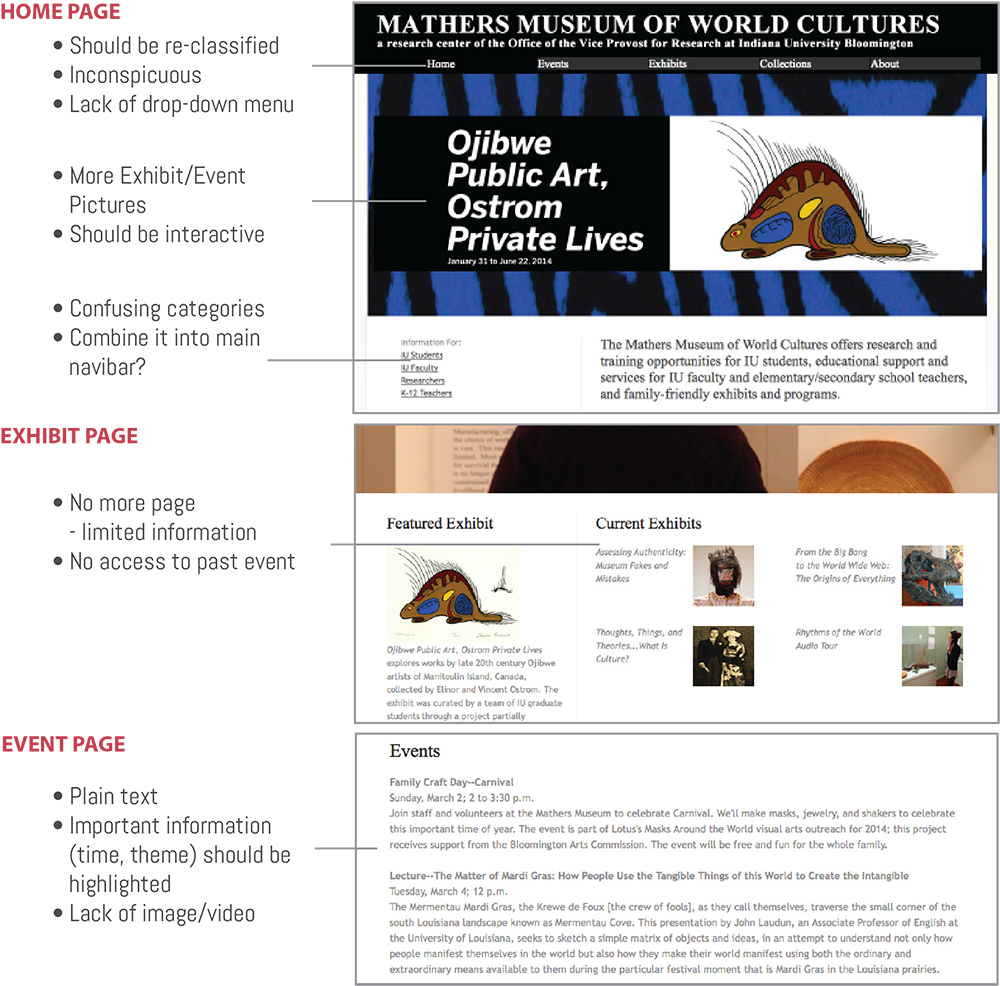
To assess the current Mathers Museum website we created a summary of the website and flow chart detailing what is on the site now and how that content is laid ou. We found that much of the content was based out of the homepage rather than through navigational menus and some items were repeated on multiple pages.

04 Contextual Inquiry and Interview

Subject: Jason Baird Jackson, Director
Time: Oct.10, 2013


For the interview, we developed a list of questions broken into categories – a total of eighteen questions that asked about the current website, such as likes and dislikes about the site, and missing content; users of the site, with a focus on external user experiences; peer websites for comparison purposes; and what his expectations for the new website. We also provided Jason with copies of the Word doc and flow chart that we had created showing the content and flow of the site. Jason gave extensive, big-picture answers to our questions that provided a wealth of information about the direction we should head in for the new website. He also gave us some keywords to think about while designing the site.

Subject: Staff group
Time:Oct.17,2013


The next week we drafted a list of questions that was much shorter, but similar to those we asked Jason, to ask museum staff members. We met with five staff members in a casual focus group-style of meeting. This meeting generated a good discussion with lots of ideas, both about the positive and negative aspects of the current site, and what might be nice or useful for the new website. They also made some interesting points that may have been due to the age bracket of the staff, such as legibility issues, link color, site maps, drop down menu indicators, and such similar items.

Subject: External user
TimeFrame:Oct.15,2013-Nov.31,2013


A short Survey Monkey survey about the current site and possible new content was drafted as a means of reaching out to external users for their opinions. The link to the survey was included in the newest MMWC electronic newsletter as a means of delivering the link to this audience. Unfortunately, there was an extremely low response rate to the survey. The responses we received indicated that users would like to see more images and detailed information about the collections.
05 Card Sort

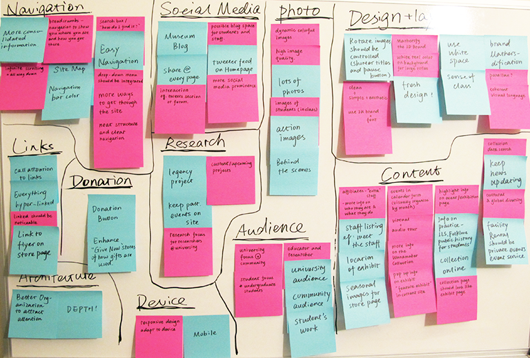
Then we use the interaction design method card sort to collect all the ideas and suggestions from previous interview and survey from director and staff. Once all of the ideas had been written down, we rearranged and organized the notes according to themes and ideas. This allowed us to see overall trends in the information we had gathered and place this large amount of information into manageable categories. We created twelve categories: navigation, links, architecture, volunteers, donation, devices, social media, research, photos, audience, design, and content.

06 Balsamiq Mockup

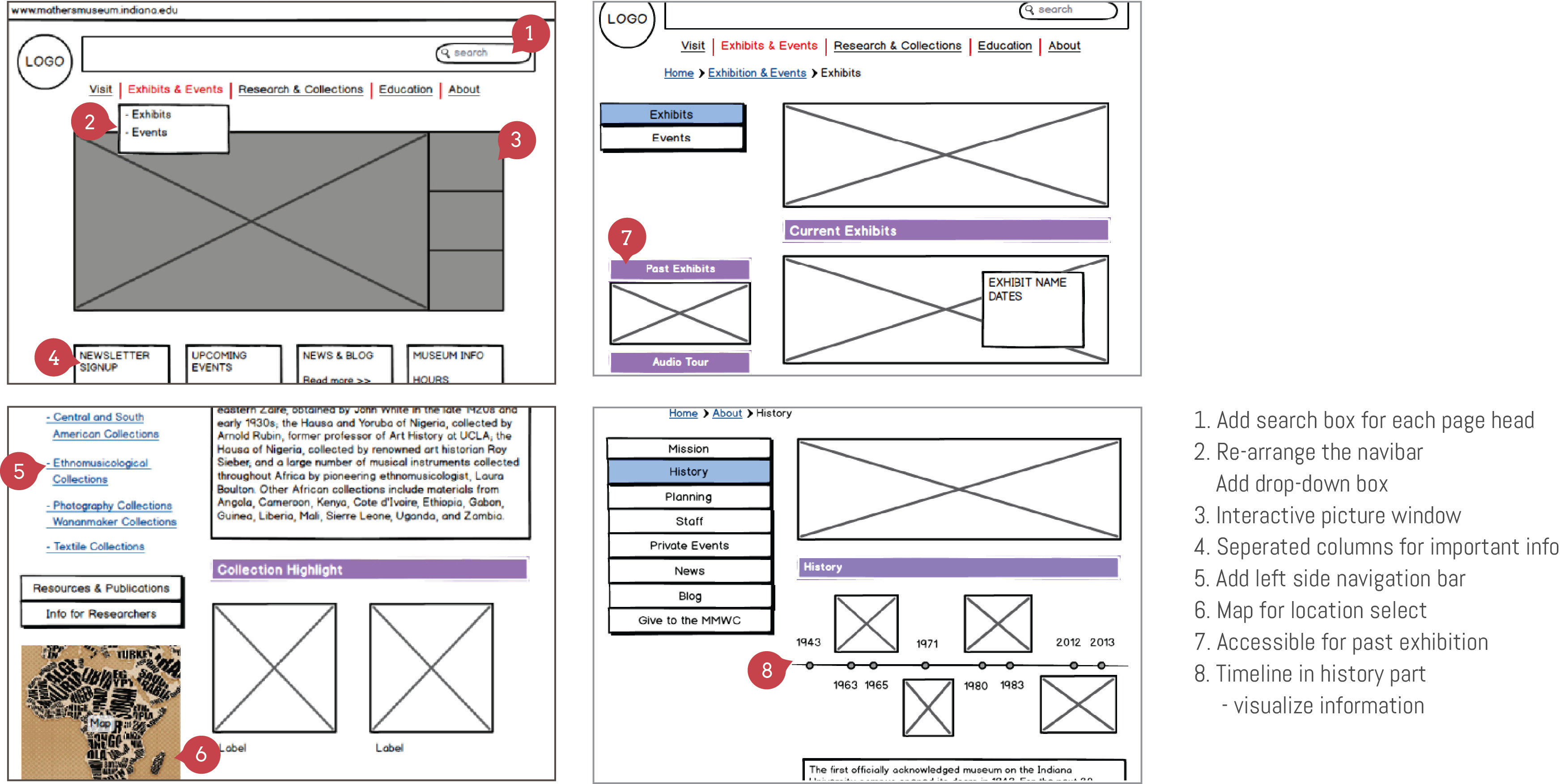
Each page of the future site, 30 pages in all, was constructed with basic shapes to show a bare-bones version of what it would eventually look like. Specifically, we added a breadcrumb menu, dropdown menu and left side navigation, all of which help the user to locate the information they are looking for. The resulting file was an interactive PDF that allowed the viewer to click through pages, similar to how it would work on the real website. We spent three weeks to complete the whole prototype, and then sent it out to the staff for feedback.

07 Usability Test

Subject | Judith A. Kirk, Assistant Director | Sarah Hatcher, Head of Programs and Education | Kelly Wherley, Facilities Manager

Time | Decemeber, 2013

Process |
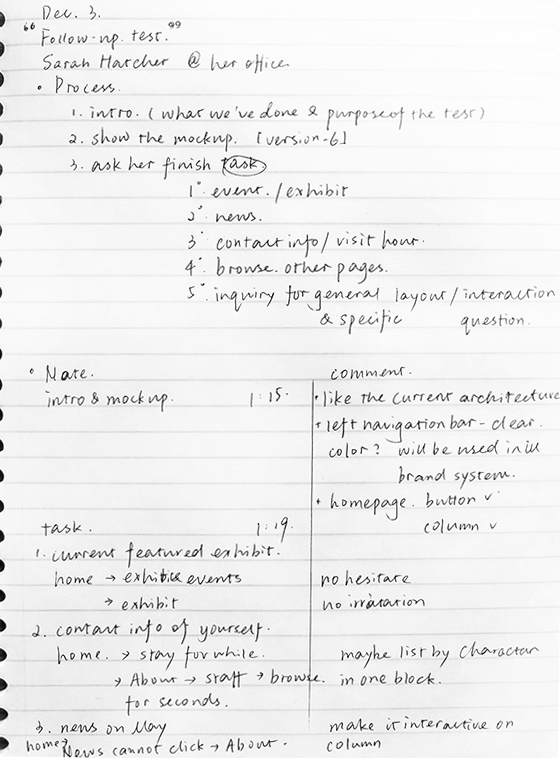
1. Introduce the purpose of the text
2. Present the Balsamiq mockup file
3. Conduct and record task test: find the current feature exhibit; find contact information and visit hour; find the news on May
4. Ask them browse the whole file for five to ten minutes
5. Inquiry for user experience: especially for homepage, exhibit and collection pages

Feedback | The feedback we received from the text was positive, though Sarah did comment that it was hard to visualize an actual site based on the prototype from the sort of blank look of the document. However, she determined that the layout was good and the navigation was clear, and gave only minor suggestions of things to add. Kelly made comments relating to the collections page navigation consistency, but generally we did not receive negative feedback.

08 Visual Design

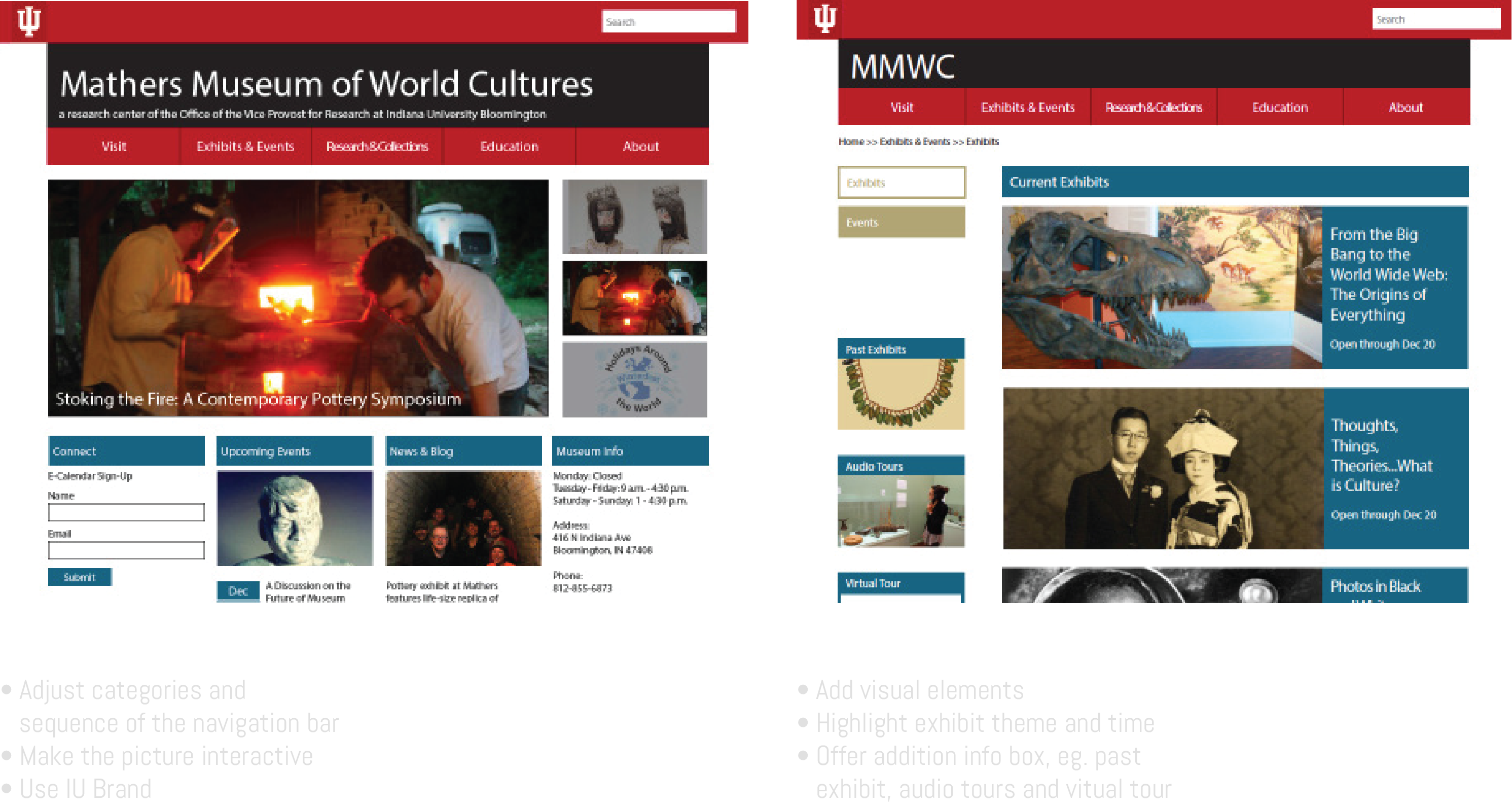
We started a visual design in InDesign, adding in color and images. This design was based on the new branding direction of previously created Mathers Museum materials. This visual design was sent out to museum staff for their opinions and made several modify.

Gengsu Tu |

Team project by Gengsu Tu | Kiva Reinbold
Sep, 2013
Timeframe: 12 weeks

Back to Top ↑